
Ecommerce product pages have evolved quite a bit over the last 20 years and continue to do so. Gone are the days when a simple photo and a brief product description would be enough to convince customers to make a purchase. Today, users expect a high-quality, interactive, and informative experience when they visit a product page. To meet these expectations, businesses must embrace a systematic approach to testing and in some cases, implementing without testing, best practice product page features. Learning from the best examples is crucial to meet modern customer expectations and to ensure your ecommerce site stands out.
A good way to prioritize your product page AB testing strategy is to borrow from the top ecommerce store sites on the internet. We looked at the following e-tailers and isolated the most important features that the majority use. We consider these to be best practices, and, because all of these sites extensively AB test, they are market proven. Studying these online store examples is crucial for understanding how to effectively optimize product pages, highlighting the importance of clear and accurate information, easy navigation, and SEO best practices to attract potential customers.
You should compare your product page across these features and prioritize testing any that your site is missing. This is one of the pieces of our ITERATE program and it is very effective in getting quick wins for your conversion rate.
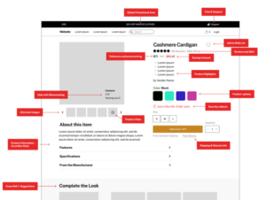
Based on all the current best practices for ecommerce product pages, here are the most important features for the 'perfect' product page (see below for discussion of each component):
Best practice ecommerce product page: Link to Figma
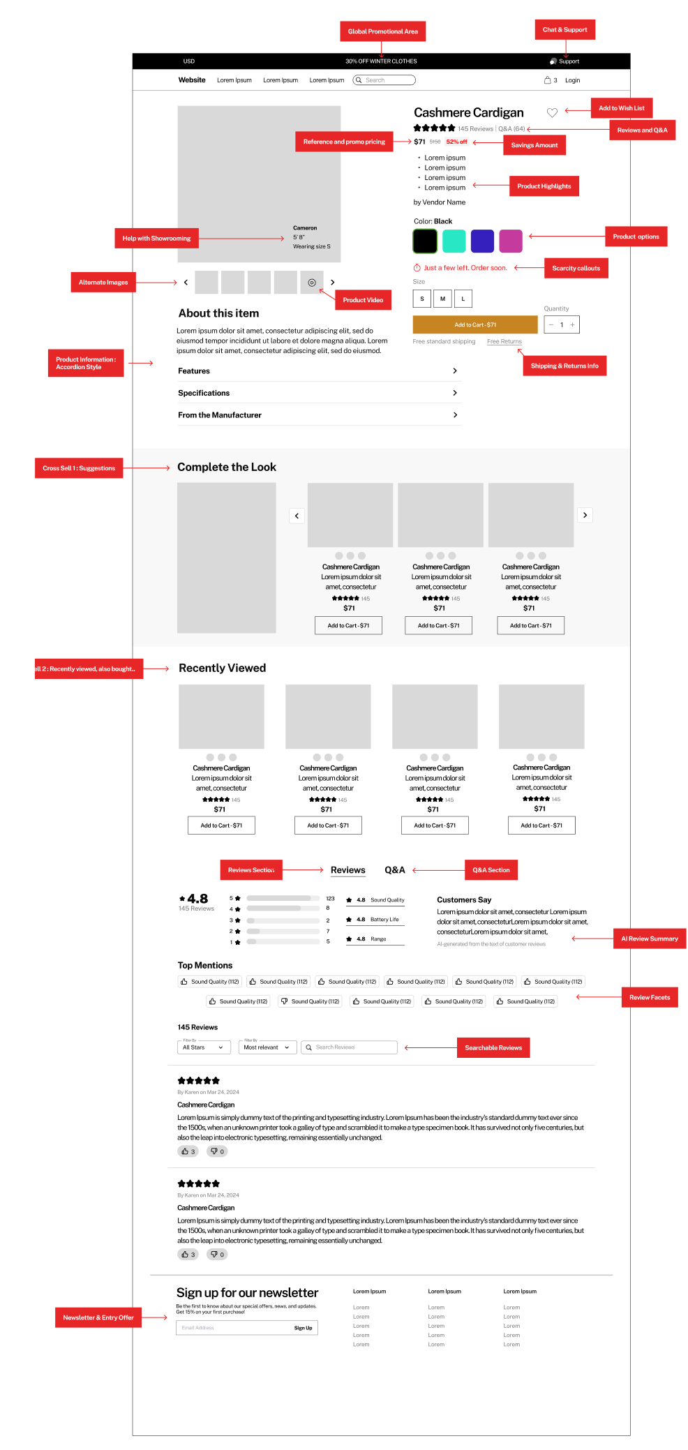
Let's break down each feature individually (note: for the purposes of this article, we will focus on the body of the PDP and not discuss global elements):
Making it easy to add to wish list with or without an account is a key part of a retention strategy. Some customers may not be ready to make a purchase immediately, but they might want to save products for later or create a wish list for future reference. By providing an easy-to-use wish list feature, you enable customers to save items and come back to them when they are ready to buy.
Wish list examples

Social proof, including reviews and Q&A is the most important single feature for an ecommerce product page. Review stars should be prominent, above the fold and link to the review section lower on the page and the same goes for Q&A.
Reviews at top of page
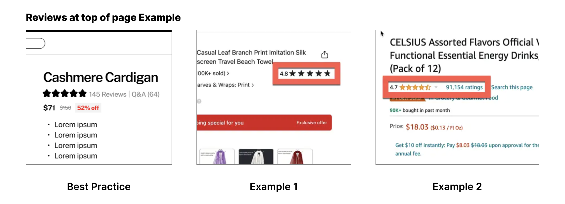
Lower on the page, its also important to innovate and keep up with evolving best practices for the reviews and Q&A element. Here, the emerging best practices are allowing users to interact with this social proof through search, faceting and filters, and with AI summaries that surface the most important features and issues of the product.
Review features at bottom of page

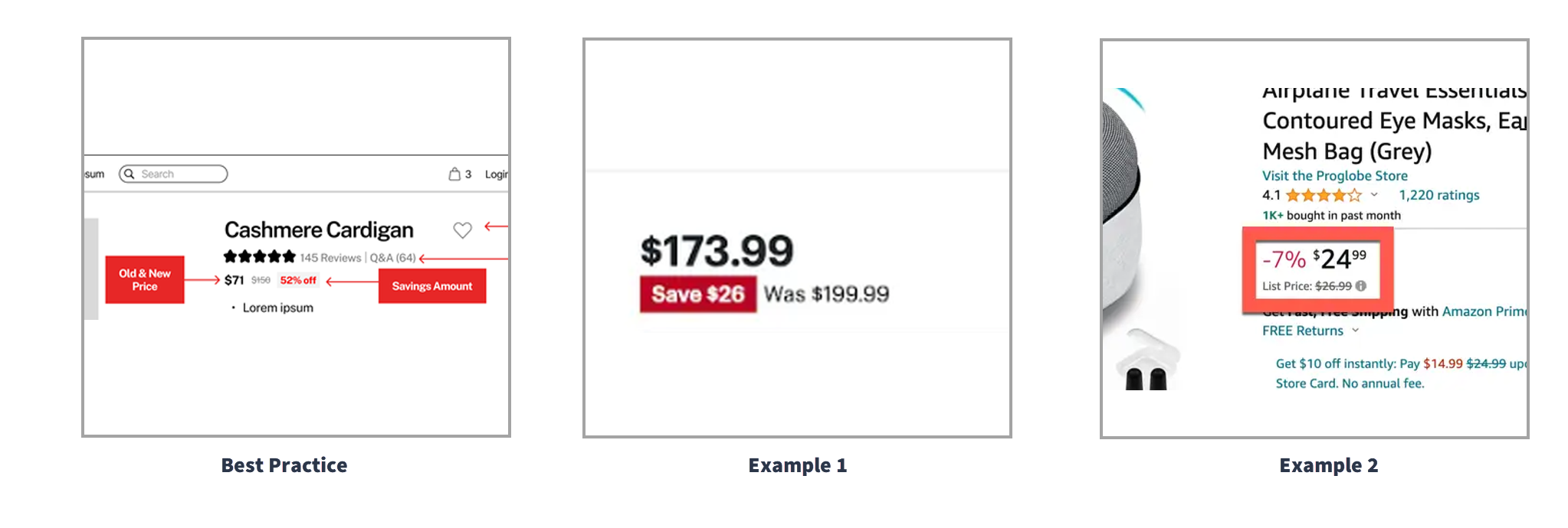
Reference, or strikethrough pricing, is a common technique to imply value and savings. Additionally, it's important to include the savings amount in dollars or in percentage.
Reference pricing examples
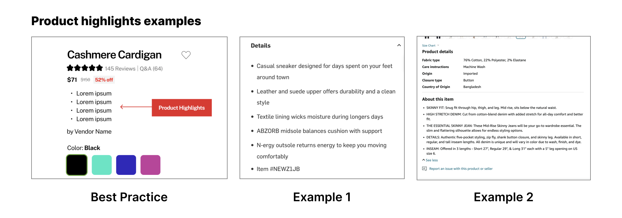
Having product highlights in bullet or short paragraph form has tested positive again and again. Giving users an overview of the product in a few moments helps them understand if the product will fit their needs or if they should continue their search. It's also an opportunity to sell the product to those on the fence and who also have limited time and attention.
Product highlights examples
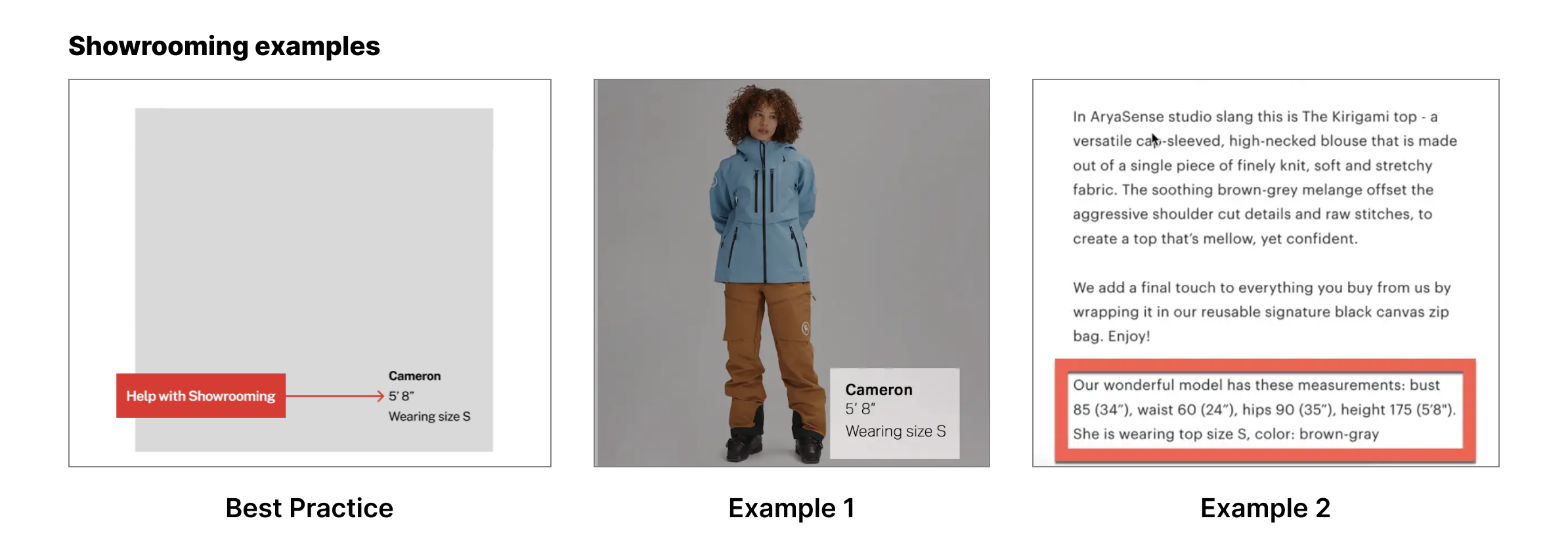
Helping with Showrooming means using methods to address the issue of not being able to physically see or touch a product. One way to do this is by providing information about whether the product fits true to size, runs large, or runs small. Another effective strategy is displaying the height and size of the model wearing or showcasing the product in the images. This feature provides strong social proof for customers and is also a useful source of product information. Although it may be challenging to gather this information, it is important to include it on ecommerce product pages.
Showrooming examples
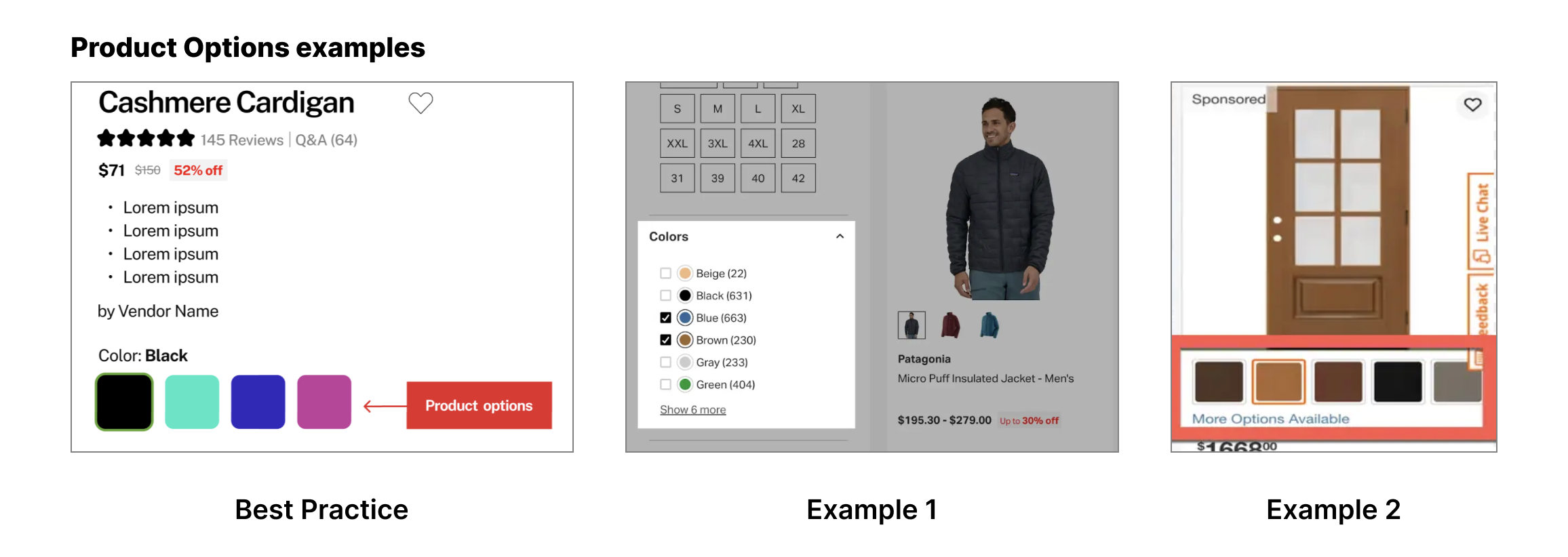
Product options should be easy to use and interactive when possible. Color options when selected should change the main product image, and other options should also be interactive when possible.
Product Options examples
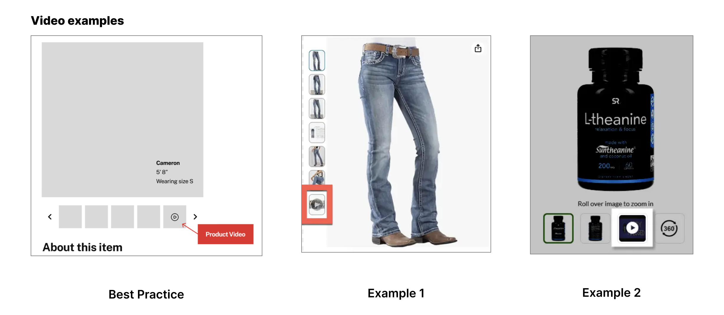
Product thumbnails are a fruitful area for testing and innovation. In addition to multiple angles and aspects of the product, brands are using social proof and even product features effectively in this area. Product video is also effective for improving conversion, but in most cases they should not be in the first thumbnail position.
Product video in thumbnails examples
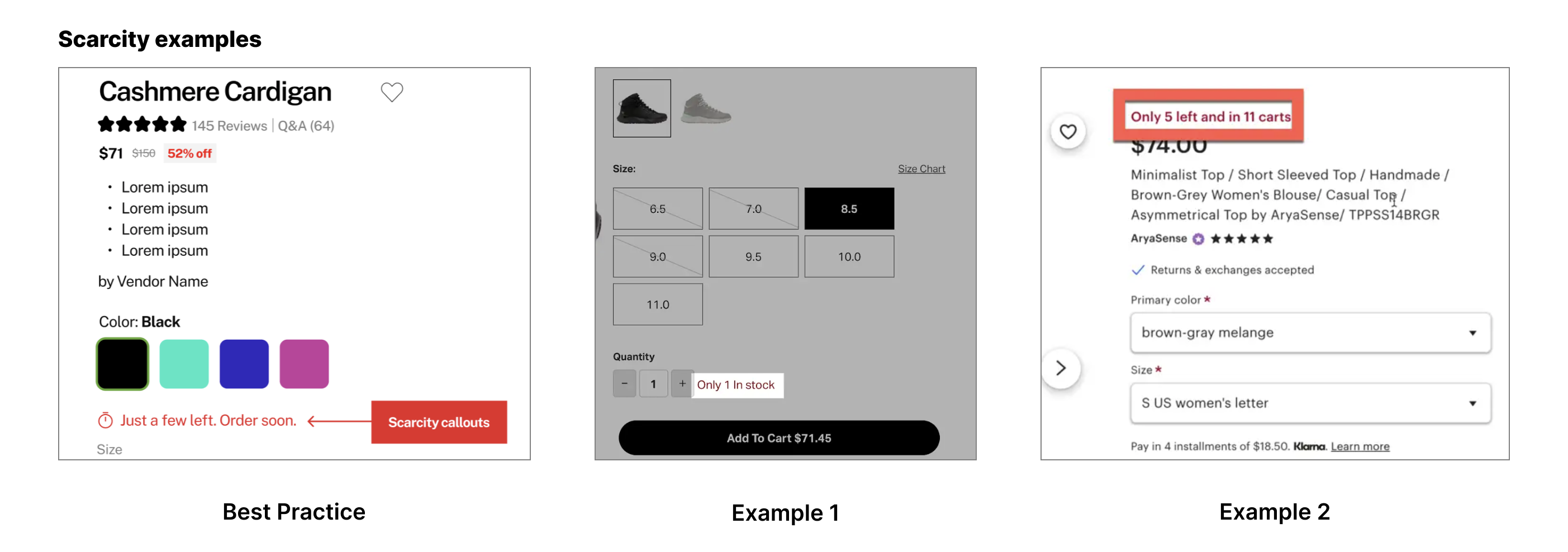
Introducing scarcity is a very effective CRO tactic and is best practice when possible. Inventory scarcity is a typical approach, but time based and other innovative approaches work here.
Scarcity element examples
Using benefit statements near the CTA (but not too near) is a common and effective strategy. Highlighting free shipping, free returns, satisfaction guarantees, fast shipping or other benefits improves conversion and should be tested.
Benefit element examples

This is a best practice, but should be tested and not implemented automatically. Its effectiveness lies in allowing users to scan the product information and select items that are of most interest to the user. It also gets the review section more prominent and accessible along with the cross sells and related items which probably contribute to its positive impact.
Product accordion examples

The best practice here is at least 2 recommender sections. We have found that even adding a third recommender section tests well in most cases. This is a crucial area for testing and is vital to improving your average order value and improving conversion. There are many potential enhancements to test here in terms of what to feature in each recommender area (also bought, accessories, related, recent) as well as the algorithm or rules for each section. ecommerce brands should be constantly testing this section.
Cross sell examples

We have called out the most important features you should focus on first because they are most likely to improve conversion rate and are relatively easy to AB test. There are a number of other features that you should also make sure you are looking at, here's a non-exhaustive list of 2nd tier product page best practices for user experience and conversion:
When designing an effective product detail page for your ecommerce website, it is crucial to include comprehensive and detailed product information. This information should answer any questions that a potential customer may have about the product, even before they think to ask. By providing detailed descriptions, specifications, and features, you can help shoppers make informed purchasing decisions. Including high-quality images, zoomable photos, and multiple angles will also enhance the overall user experience and increase the likelihood of conversions. Remember, the more information you provide, the more confident customers will feel in making a purchase. Partnering with a trusted agency like ConversionTeam can help you create product detail pages that are not only visually appealing but also optimized for conversions.
High-resolution visuals and multiple images and angles are essential for a successful ecommerce product page. Visual content plays a crucial role in capturing the attention of potential customers and conveying the value and features of a product.
In addition to high-resolution visuals and multiple images, another important feature to include in your ecommerce product page is a product Q&A section and a FAQ section. These sections provide customers with the opportunity to ask questions about the product and find answers to commonly asked questions.
When it comes to creating a descriptive product title, it is important to keep it concise yet informative. Your product title should clearly convey what the product is, its key features, and its benefits. A well-crafted product title will grab the attention of potential buyers and entice them to click on your product page for more information.
Another powerful form of social proof is user-generated content (UGC). UGC refers to any form of content, such as reviews, photos, videos, or social media posts, that is created by customers or users of your products.
To meet the expectations of online shoppers, it's essential to provide detailed product information, including technical parameters and product features. Highlighting the technical parameters of your product is crucial on an ecommerce product page. While user-generated content provides valuable insights into customers’ experiences with the product, technical parameters offer specific details about its specifications and functionality.
It's important to communicate any guarantee or warranty that comes with the product. This helps to overcome fear and instill confidence in potential buyers and assures them that their purchase is protected.
The above features are table stakes for any ecommerce website, but for larger brands there are specific features that deserve a full articles to themselves, these include:
Autoship or subscribe & save is a great feature for larger brands that have repeat customers or products that need to be replenished regularly. It allows customers to set up automatic recurring orders, ensuring that they never run out of their favorite products. This feature not only increases convenience for customers, but it also boosts customer loyalty and helps drive repeat purchases.
The Buy Online Pick-Up In-Store (Bopis) feature has become increasingly popular among larger brands. It allows customers to browse and purchase products online and then pick them up at a physical store location. This feature offers convenience and flexibility to customers who prefer to shop online but want to collect their items in person. It also provides an opportunity for retailers to increase foot traffic to their physical stores and potentially upsell or cross-sell additional products.
Advanced product recommenders go beyond the typical "Customers who bought this also bought" recommendation feature. They use algorithms and machine learning to personalize recommendations based on a variety of factors such as browsing behavior, purchase history, and demographic information. This helps customers discover new products that they are likely to be interested in, increasing the chances of upselling and cross-selling.
You should be personalizing the user experience on the PDP through recommenders and highlighting reviews that might be most relevant to the user. This is a cutting edge and rapidly evolving area that ecomm managers need to stay cognizant of.
Loyalty and points programs are excellent tools for ecommerce businesses to retain customers and encourage repeat purchases. By offering benefits and rewards to loyal customers, businesses can create a sense of appreciation and incentivize continued engagement with their products or services. Highlighting the perks of these programs on product pages can help drive conversions and foster a strong relationship with customers. Ultimately, loyalty and points programs can be a valuable investment in customer retention and long-term success.
We based the research in this article on the top ecommerce sites in the world in order to focus on product page best practices that work for ecomm sites in all verticals. You should do the same research on your competitors, identifying features that are specific to your industry and making sure you have parity there first, but ultimately that you are testing new features before your competitors. this is how the top sites in their niche achieve competitive advantage and market dominance.
Stay tuned for future articles breaking those down, and feel free to contact us to chat about product page or site strategy for CRO.
The most important features are those that are best practices and that your site lacks. These features should be immediately AB tested to validate that they improve or are at least neutral for conversion, and then should be added to your site.
You should start by identifying gaps as described above, then systematically AB testing the features with the most potential. This is something we can help with prioritizing via a HITLIST audit or our ITERATE program.
A/B testing, also known as split testing, is a method used to compare two versions of a webpage to determine which one performs better. By testing different elements such as product descriptions, images, pricing, and call-to-action buttons, you can gather data on what resonates with your audience and drives more conversions. Implementing A/B testing on your product pages can help you make data-driven decisions to optimize elements and create a better shopping experience for your customers, ultimately leading to increased sales and customer satisfaction.
You should be continually optimizing your product page via AB testing and strategic addition of best practice features.