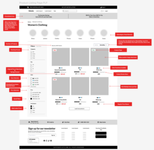

For ecommerce, the Product Listing Page (PLP) plays a crucial role in guiding customers towards making a purchase. A well-designed PLP can significantly improve user experience, increase engagement, and ultimately boost conversions. In this article, we'll explore the key features that make up the perfect PLP, based on extensive research and A/B testing results from top ecommerce sites.
As with our previous article on Ecommerce Product Detail Pages (PDPs), our research for the Perfect Product Listing Page (PLP) draws insights from some of the most successful and widely-used ecommerce platforms. We analyzed the PLPs of industry leaders including Amazon.com, Etsy.com, Homedepot.com, Nike.com, Target.com, Bestbuy.com, and Ebay.com. These top e-tailers have extensively A/B tested their PLPs, making them valuable sources for identifying best practices. By studying these online store examples, we've isolated the most important features that the majority of these sites use, providing a solid foundation for understanding how to effectively optimize product listing pages.
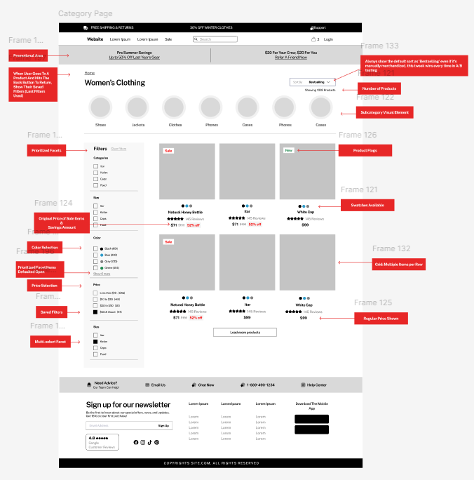
Based on our comprehensive analysis of current best practices in ecommerce, we’ve identified the most crucial features for creating an effective product listing page (PLP). These elements are essential for optimizing user experience, enhancing product discoverability, and ultimately driving conversions. In the sections that follow, we’ll dive into each of these components, explaining their importance and how to implement them effectively:
Best practice Product Listing page (PLP) link to Figma
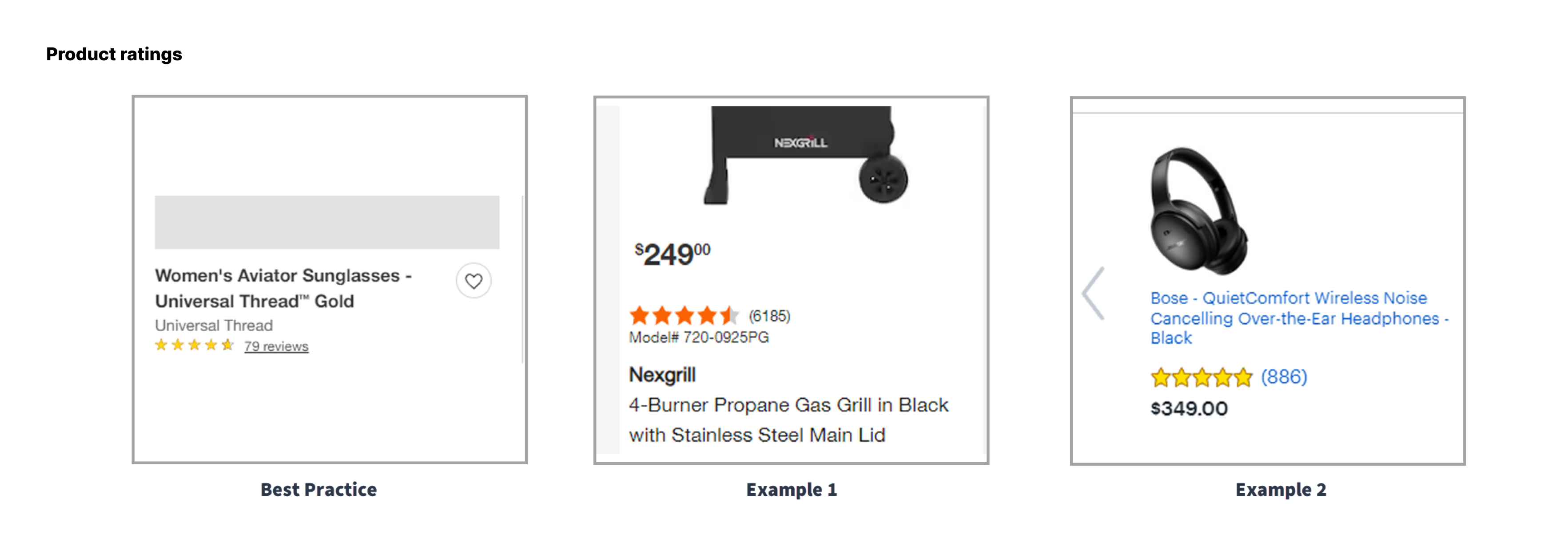
The category page should include product review star icons and number of reviews for context. This is one of the most used and most important filters on the PLP and should be visually prominent.
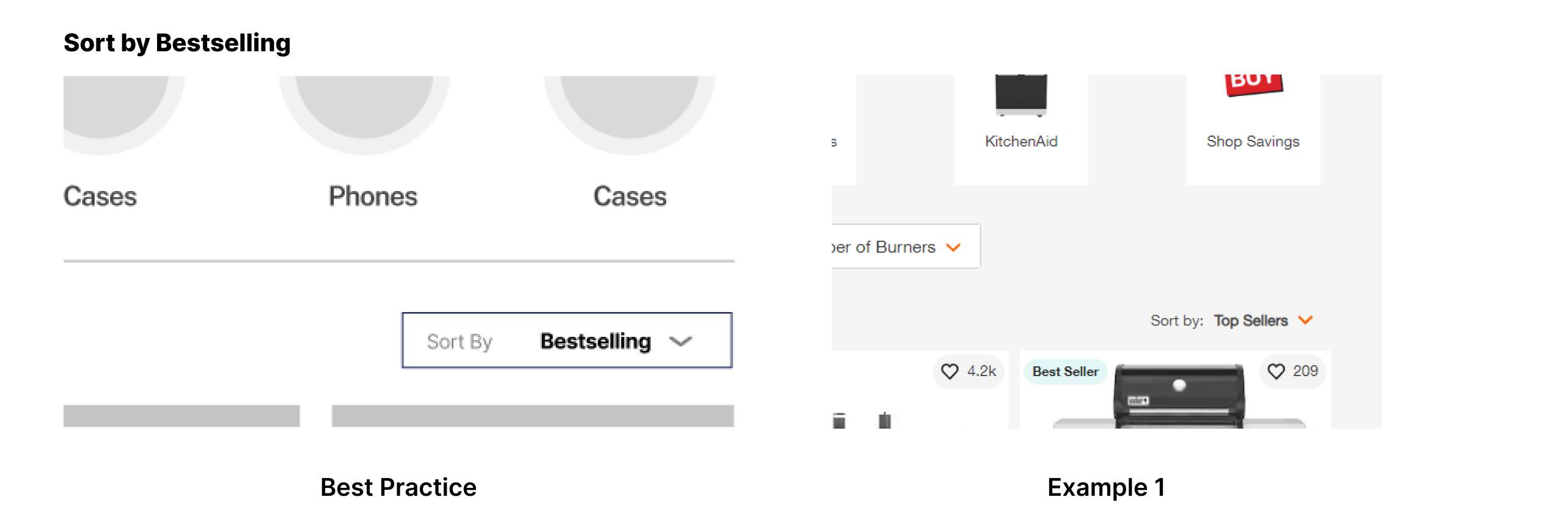
A small, but impactful tweak to your sort options is setting the default sort to "Bestselling." Our A/B testing consistently shows that this approach outperforms other sorting options. Even if your bestselling list is manually merchandised, labeling it as the default view gives users confidence that they are looking at items popular with their peers and increases the odds of them making a purchase. Interestingly, the largest ecommerce websites aren't always doing this which we attribute to the following: The largest sites have the most sophisticated algorithms and the big enough sample sizes to forgo the relatively small benefit of this tweak in favor of showing products personalized to that specific user. Or said another way, it'll probably work for your site unless you have millions of users.
Showing the total number of products available in a category page is a best practice for all ecommerce sites. This simple feature helps users understand the scope of options available to them, setting expectations for their browsing experience. Of note is the lack of pagination interface elements we're seeing in 2024 - it seems the top sites have decided that this is adds complexity without user benefit and we are now recommending you do the same.
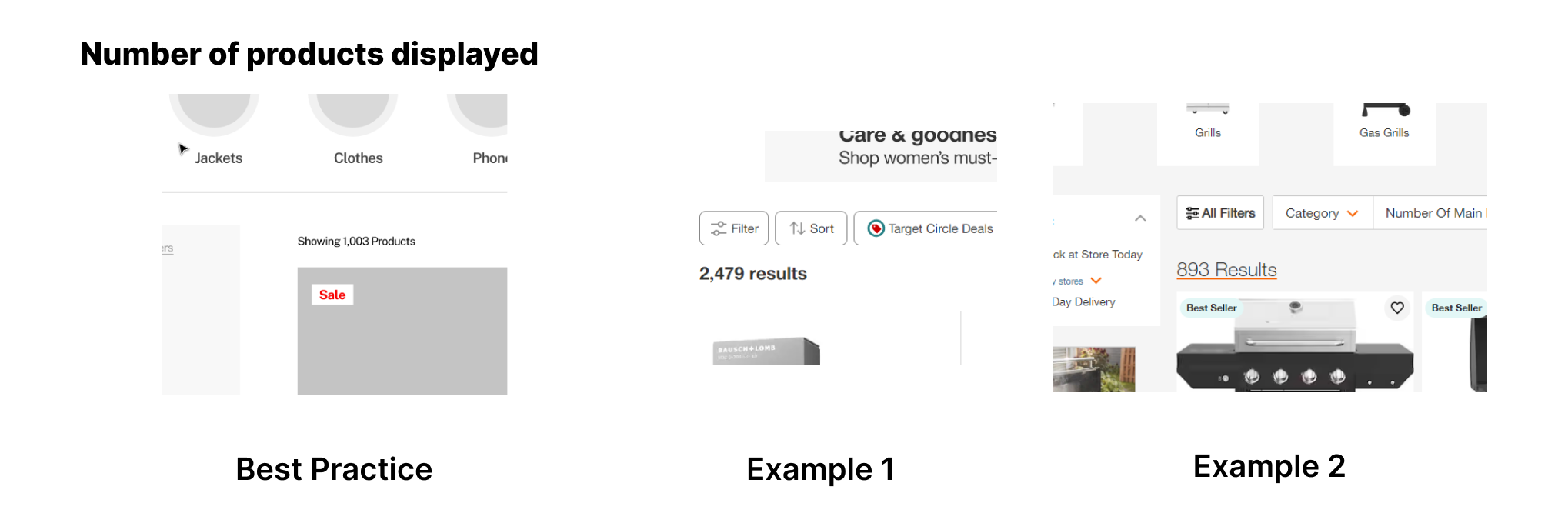
Implementing image thumbnail or button-based elements that allow users to filter or move to subcategories has tested very well. This feature enhances navigation and helps users quickly find the specific products they're looking for. As of this year (2024), this has become a best practice for ecommerce sites.

Product flags, such as “New,” “On Sale,” or “Best Seller,” can be effective in drawing attention to specific items and attracting potential customers. There are gotchas here, however. Keep your product flags meaningful to customers – not every product can be a “best seller.” Always test this feature, as its impact can vary depending on your specific audience and product range.

Presenting color options through swatches for products in the gallery is great for user experience and should be used when possible. This feature allows customers to quickly see available color options without navigating away from the PLP.

Displaying multiple items per row is an ecommerce site best practice for both desktop and mobile product listings. On desktop, a grid layout is standard. Best in class sites have moved away from giving grid options (ie: number of columns) in favor of simplicity and we recommend you do the same. For mobile, we generally recommend a two-column grid layout, but as always, this should be tested for your specific site and audience.
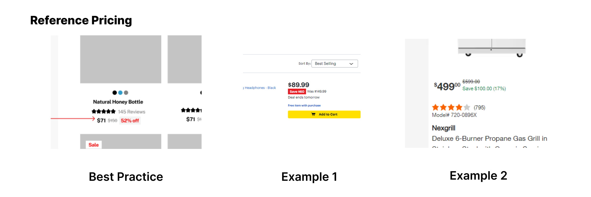
Showing the reference price on the PLP is an ecommerce best practice. It allows users to quickly assess the value of products based on discounts off the retail price. When multiple promotions apply (ie: a sitewide or seasonal promo along with autoship or subscribe and save discounts), multiple strikethroughs have tested well proving you can't have too much prominence on given discounts.
Including space near the top of the product listing page for category-specific promotions or sitewide sale messaging can be highly effective. As of 2024, more brands are implementing this feature. We recommend testing this approach to see how it performs with your specific audience.

When a user goes to a product page and then returns to the listing page, it's crucial to maintain their previous position and show their saved filters. This creates a seamless browsing experience and is an ecommerce best practice.
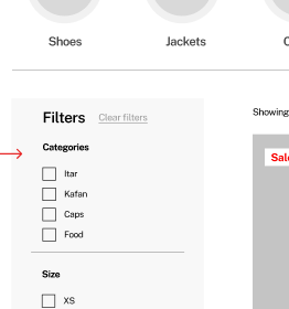
Organizing facets by usage rather than alphabetically has consistently proven more effective in testing, especially for sites with numerous facets. This approach helps users quickly find the most relevant and commonly used filters. This CRO optimization exercise involves first tagging all facets, collecting usage data and then multiple rounds of testing in order to optimize the order of the facets, the default state of each (collapsed or open) and finally which to hide in a 'more' section. This is a very fruitful area to focus AB testing on.
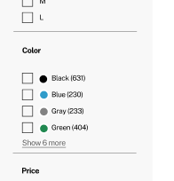
Displaying color swatches rather than just color names in facets has tested positively. While results are split, we consider this a best practice that enhances the user experience by providing visual cues.
Allowing users to filter products by price range is an ecommerce site best practice. This feature helps users quickly narrow down options to fit their budget.
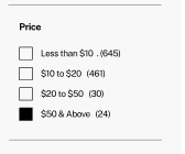
The ability to select multiple filter options within a category is incredibly important for ecommerce sites. This feature allows for more targeted results and enhances the overall shopping experience.
While not included in our core list of best practices, the following features may be worth testing on your PLP:
Sticky Filter/Sort Bar: Effective on desktop for tall category pages, but challenging to implement on mobile due to space constraints.
Lazy Load vs. Pagination: While lazy loading was popular in the past, it’s no longer considered a CRO best practice. However, it may have positive SEO effects by improving visibility on search engines.
Alternate Image on Mouse-over (Desktop): This feature could go either way and should be tested before implementation. We have had some success with showing a secondary product image on hover vs a wishlist overlay.
Quick Add-to-Cart CTA: No longer a best practice for ecommerce sites, but may be worth testing in specific contexts.
Quick View: This feature has fallen out of favor and is no longer considered a best practice.
Creating the perfect PLP involves a combination of best practices and continuous testing. By implementing these key features and regularly assessing their performance, you can create a PLP that not only meets user expectations but also drives conversions and enhances overall ecommerce success.
Remember, while these features have proven effective across many ecommerce sites, it's crucial to test them with your specific audience and product range. What works for one site may not work for another, so always rely on data-driven decisions to optimize your PLP for maximum effectiveness.
While there's no set rule, it's advisable to regularly review and update your PLP design. Aim for a major review or CRO Audit at least twice a year, but also keep an eye on industry trends and what your competitors are doing. Continuous A/B testing of small changes through a program like ITERATE is the best approach and provides compounding conversion rate changes that almost always outweigh the need for complete overhauls.
Strike a balance by prioritizing user experience. Ensure that your design choices enhance rather than hinder product discovery. Use white space effectively, maintain consistent branding, and ensure that all interactive elements are intuitive. Remember, a visually appealing PLP that's difficult to navigate won't convert well.
Keep an eye on AI-powered personalization, augmented reality for product visualization, and voice search optimization. These technologies are becoming increasingly relevant for PLPs. However, always assess their potential impact on your specific audience before implementation.
Beyond responsive design, consider implementing touch-friendly filters, simplified navigation, and faster loading times. Also, ensure that product images are optimized for smaller screens without losing quality. Consider using a 'sticky' add-to-cart button for easy purchasing on mobile.
Key metrics include click-through rate (CTR) to product pages, average time spent on the PLP, bounce rate, and conversion rate. Also, track filter usage to understand user preferences and behavior. Heat mapping tools can provide valuable insights into how users interact with your PLP.
Focus on optimizing category descriptions, using relevant keywords in product titles and descriptions, and ensuring proper use of header tags. Implement schema markup for rich snippets in search results. Also, make sure your PLP loads quickly and is mobile-friendly, as these are important ranking factors.
This depends on your products and target audience. Infinite scroll can work well for discovery-oriented shopping, while pagination is often better for goal-oriented shoppers. Consider offering both options and A/B test to see which performs better for your specific use case.
Use real-time inventory updates to show low stock levels, highlight limited-time offers, and showcase products that are trending or selling fast. However, ensure all such information is genuine to maintain trust with your customers.
Machine learning algorithms can analyze user behavior, purchase history, and product attributes to create personalized product rankings. Implement a system that considers factors like click-through rates, conversion rates, and user preferences. Gradually introduce machine learning-driven recommendations alongside your manual merchandising efforts, and use A/B testing to refine the algorithm's performance over time.
Manual merchandising still plays a crucial role, especially for seasonal promotions or new product launches. Use a mix of data-driven insights and human expertise. Prioritize high-margin or strategically important products, but ensure this doesn't compromise the overall user experience. Regularly rotate featured products to keep the PLP fresh for returning visitors. Consider creating curated collections or "shop the look" features to showcase product combinations.
Develop a hybrid approach that combines machine learning with rule-based systems. Set up business rules that reflect your strategic objectives, such as promoting certain brands or product categories. Then, allow the machine learning algorithm to optimize within these constraints. This approach ensures that your PLPs remain aligned with business goals while still benefiting from data-driven optimization. Regularly review and adjust your rules based on performance data and changing business priorities.